Linear regression is a fundamental supervised learning algorithm used to model the relationship between a dependent variable $y$ and one or more independent variables $x$. In its simplest form (univariate linear regression), it assumes that the relationship between $x$ and $y$ is linear and can be described by the equation:
$$ \hat y = k \cdot x + d $$
But we can have arbitrarly many input features, as long as they are a linar combination in the form: $$ \hat y = w_0 + w_1 x_1 + w_2 x_2 … w_n x_n$$
import numpy as np
import matplotlib.pyplot as plt
# Setup artificial data
num_points = 50
k = 3
d = 4

x = 2 * np.random.rand(num_points,1)
noise = np.random.normal(scale=0.8, size=x.shape)
y = d + k * x + noise
# Plot data
def plot_data():
    fig, ax = plt.subplots()
    ax.scatter(x, y, s=10)
    ax.plot([0, 2], [d, 2 * k + d], color="red", label="Ideal Solution")
    ax.legend()
    return fig, ax

plot_data()
plt.show()
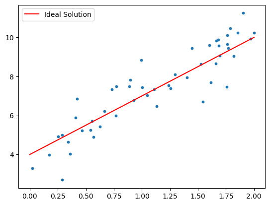
Even with the ideal parameters, the model doesn’t perfectly fit the data due to the added Gaussian noise.
Mean Squared Error
The model’s performance is commonly evaluated using Mean Squared Error (MSE): $$MSE=\frac 1 n \sum_{i=1}^n (y_i−\hat y_i)^2$$
def mean_squared_error(y, y_hat):
    return np.sum((y - y_hat)**2)/ y.shape[0]

y_ideal = d + k * x

print("Mean Squared Error: ", mean_squared_error(y, y_ideal))
Mean Squared Error: 0.6149312404134968
Even the ideal model incurs some error due to noise.
Closed-Form Solution (Normal Equation)
In practice, the true parameters $k$ and $d$ are unknown. Fortunately, there exists a closed-form solution using linear algebra. First, we express the model as:
$$ \hat{\mathbf{Y}} = \mathbf{X} \mathbf{w} $$
Where:
- $\mathbf{X}$ is an $n \times (d+1)$ matrix with a column of ones for the intercept term.
- $\mathbf{w}$ is a vector of model parameters.
- $\hat{\mathbf{Y}}$ is the vector of predictions.
The loss function becomes:
$$ J(\mathbf{w}) = |\mathbf{y} - \mathbf{Xw}|^2 $$
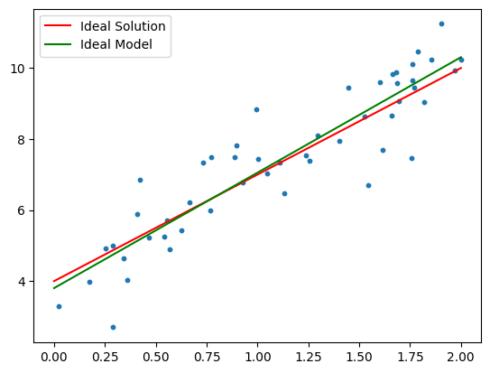
Setting the gradient to zero and solving yields the normal equation:
$$ \mathbf{w} = (\mathbf{X}^T \mathbf{X})^{-1} \mathbf{X}^T \mathbf{y} $$
# adding column of ones to X
ones = np.ones((x.shape[0], 1))
X = np.hstack((ones, x))
# calculating ideal w and predicting y values
w = np.linalg.inv(X.T @ X) @ X.T @ y
Y_hat = X @ w
mean_squared_error(y, Y_hat)
np.float64(3.457589455007784)
fig, ax = plot_data()
ax.plot([0,2], [w[0], w[1]*2 + w[0]], color="green", label="Ideal Model")
ax.legend()
plt.show()
Applying Linear Regression to Real Data
Let’s now apply linear regression to a real-world dataset: California Housing, using sklearn.linear_model.LinearRegression.
from sklearn.datasets import fetch_california_housing
from sklearn.linear_model import LinearRegression
from sklearn.model_selection import train_test_split

data = fetch_california_housing(as_frame=True)
df = data.frame
df
| MedInc | HouseAge | AveRooms | AveBedrms | Population | AveOccup | Latitude | Longitude | MedHouseVal | |
|---|---|---|---|---|---|---|---|---|---|
| 0 | 8.3252 | 41.0 | 6.984127 | 1.023810 | 322.0 | 2.555556 | 37.88 | -122.23 | 4.526 |
| 1 | 8.3014 | 21.0 | 6.238137 | 0.971880 | 2401.0 | 2.109842 | 37.86 | -122.22 | 3.585 |
| 2 | 7.2574 | 52.0 | 8.288136 | 1.073446 | 496.0 | 2.802260 | 37.85 | -122.24 | 3.521 |
| 3 | 5.6431 | 52.0 | 5.817352 | 1.073059 | 558.0 | 2.547945 | 37.85 | -122.25 | 3.413 |
| 4 | 3.8462 | 52.0 | 6.281853 | 1.081081 | 565.0 | 2.181467 | 37.85 | -122.25 | 3.422 |
| ... | ... | ... | ... | ... | ... | ... | ... | ... | ... |
| 20635 | 1.5603 | 25.0 | 5.045455 | 1.133333 | 845.0 | 2.560606 | 39.48 | -121.09 | 0.781 |
| 20636 | 2.5568 | 18.0 | 6.114035 | 1.315789 | 356.0 | 3.122807 | 39.49 | -121.21 | 0.771 |
| 20637 | 1.7000 | 17.0 | 5.205543 | 1.120092 | 1007.0 | 2.325635 | 39.43 | -121.22 | 0.923 |
| 20638 | 1.8672 | 18.0 | 5.329513 | 1.171920 | 741.0 | 2.123209 | 39.43 | -121.32 | 0.847 |
| 20639 | 2.3886 | 16.0 | 5.254717 | 1.162264 | 1387.0 | 2.616981 | 39.37 | -121.24 | 0.894 |
20640 rows × 9 columns
This dataset contains multiple features to predict MedHouseVal (median house value), making the model more complex but also harder to visualize.
Train/Test Split and Model Training
X = data.data
y = data.target

X_train, X_test, y_train, y_test = train_test_split(X, y, test_size=0.2, random_state=42)

model = LinearRegression()
model.fit(X_train, y_train)

y_test_hat = model.predict(X_test)
mse = mean_squared_error(y_test, y_test_hat)

print("Mean Squared Error:", mse)
Mean Squared Error: 0.5558915986952444
Visualizing Predictions
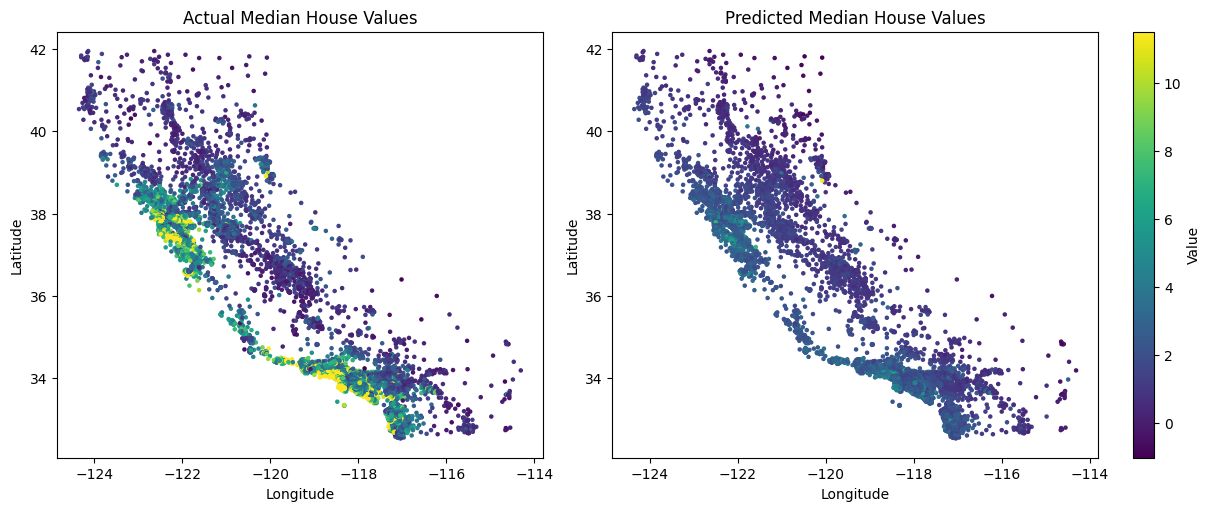
To visualize the model’s predictions geographically, we’ll plot latitude and longitude, coloring by MedHouseVal.
y_hat = model.predict(X)
fig, (ax1, ax2) = plt.subplots(ncols=2, figsize=(12, 5), constrained_layout=True)

# First plot — true values
sc1 = ax1.scatter(df["Longitude"], df["Latitude"], c=df["MedHouseVal"], cmap="viridis", s=5)
ax1.set_xlabel("Longitude")
ax1.set_ylabel("Latitude")
ax1.set_title("Actual Median House Values")

# Second plot — predicted values
sc2 = ax2.scatter(df["Longitude"], df["Latitude"], c=y_hat, cmap="viridis", s=5)
fig.colorbar(sc2, ax=ax2, label="Value")
ax2.set_xlabel("Longitude")
ax2.set_ylabel("Latitude")
ax2.set_title("Predicted Median House Values")

plt.show()

The model captures the overall trend but struggles with high-value regions, indicating that a linear model may not be expressive enough for all nuances in the data. We’ll explore more powerful models in future challenges.